GIMP has basic support for the exporting of files to SVG format. SVG files from GIMP are made predominantly from vector paths, so even though you can create SVGs in GIMP, it’s a complex process. Unfortunately, you will lose color, text, and pixel data from your file. You should only create SVGs in GIMP if you require something simple like a logo outline or icon.
This article will explain how to create SVG files in GIMP.
Create SVG files in GIMP.
In GIMP, SVG files are made using the “Paths” panel, consisting of only vector path data. Even if you’re new to image editing in GIMP, you’ll find creating SVG files simple once you get the hang of these steps.
1 – Select the “Paths” Tool
Vector paths are created in GIMP using a few different methods: the “Path from Selection” command or the “Paths” tool. Most people who’ve used a vector-creating program before are familiar with the “Paths” tool. To use the “Paths” tool in GIMP, use the letter “B” keyboard shortcut or click on it from the Toolbox.
2 – Make Your Paths
Click on the image to place the initial anchor point for the path, then click on a different spot for another anchor point. You’ll see that GIMP has automatically drawn a line between these points. Continue this process until you’ve drawn around the shape you need to save as an SVG file. Adjust the lines on every anchor point to add curves, changing each connected line’s curvature. Also, you can try a different selection tool in GIMP to form your selection and use the Path from Selection command.
3 – Use the “Paths from Selection” Tool
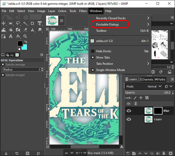
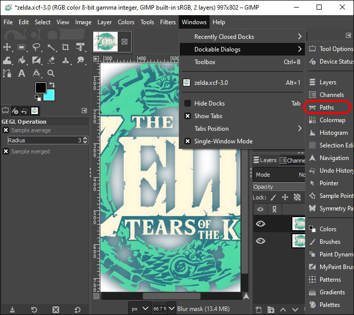
When you’ve completed your selection in GIMP, open the Paths panel, then from the bottom of the panel, select Path from Selection. By default, your Paths panel should be on the bottom right of the screen beside the Layers panel. If you can’t see it, follow these steps:
- Go to the “Windows” menu.

- Click on the “Dockable Dialogs” menu.

- Choose “Paths.”
To customize the way a path is applied to the selection, press down the “Shift” key when selecting. For the most part, this isn’t necessary. Your new path is called Selection and is listed in your Paths panel. It will be hidden by default but becomes visible when you click on the eye icon. To modify this selection, use the Paths tool and repeat the process as often as needed.
4 – Export Your Paths
After creating your vector path, go back to the Paths panel. To save the path as an SVG file, right-click on it and select Export Path from your menu options. GIMP then opens an Export Path to SVG dialog window with some exporting options. You can export the selected path or all the paths in the document. Name the SVG file and click on Save.
You’ve now successfully created an SVG file from GIMP. However, you may have also discovered that it’s not ideal for the SVG file type you need. If this is the case, you’ll find steps for other applications below that are useful to create a more advanced type of SVG file.
Convert Images to SVG With Inkscape
Inkscape is another free, open-source vector graphical editor that you can use to convert your images to SVG files. Here’s how it’s done:
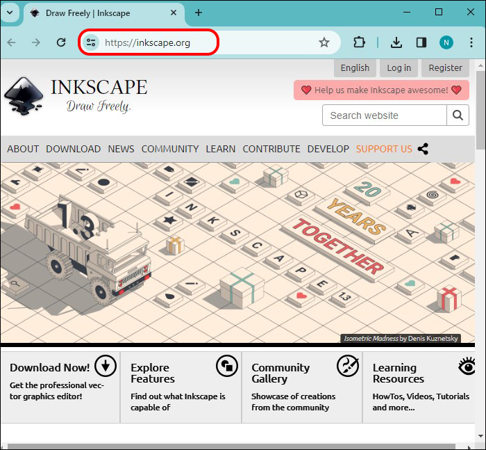
- Download and install the Inkscape application from their website.
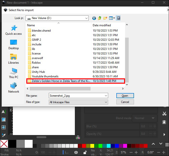
- Launch Inkscape, then go to “File.” Select “Import” and choose the image to convert to SVG.
- When the image has been imported, click on it with the “Select” tool.
- Hit “Path.”
- Choose “Trace Bitmap.” The tracing settings will open, and you can adjust the options according to your preferences. For example, you can choose the number of colors to scan.
- Go to “Update” and check the previewed traced image.
- If you’re happy with the preview, select “Apply,” and the tracing process begins.
- When the tracing process has been completed, a vectorized image will be placed above the original image.
- You can move the image, resize, or modify it according to your specifications.
- Once ready, you can save the file as an SVG via “File” and then “Save As.”


Use Autotrace to Save Images as SVG Files
Autotrace is an excellent application for converting images to SVG files. It’s a command-line application, meaning you must use a command prompt or Terminal to execute commands. Here’s how to use Autotrace to save your images as SVG files:
- Download and install the Autotrace application from their website.
- Launch “Command Prompt” or “Terminal.”
- Go to the directory where the file is saved.
- Input this command: auto trace input.jpg –output-file output.svg –output-format svg


From the command, “input.jpg” is the image’s name, and the name of the SVG file will be “output.svg.” The end of the command, “--output-format svg,” specifies that the file output must be in SVG format. Autotrace is limited and might not work effectively with some image formats.
What Is an SVG File?
The most common image file formats are PNG and JPG. But SVG files are becoming just as popular. SVG is an acronym for Scalable Vector Graphics. This means that unlike GIF, JPG, or PNG files, which are created with pixels, SVG files are created with vector graphics and can be scaled to various sizes with no loss of quality. SVG files are smaller than pixel-based files.
More specifically, SVG files are XML files, meaning they have markup tags that give the image definition, making these files easy to customize and edit. SVG files can be opened in a text editor to change markup tags, which will change the image output. E.g., the color of an SVG image can be changed by editing its color attribute in the markup tag.
Although SVG files have existed since about 1999, it’s only now that they’re becoming more popular. This is due to modern website browsers natively supporting them. Back then, you had to use a plugin like Microsoft Silverlight or Adobe Flash to view an SVG file.
SVGs are often used for illustrations, icons, and logos. They’re an ideal format for these images because they’re scalable and don’t lose their quality, making them perfect for web use. SVG files are now also used in email advertising and marketing for sending important images while retaining quality.
Use GIMP to Export Basic SVG Files
GIMP can create basic versions of an SVG file, like for a simple logo or icon, but if you need a more advanced SVG file, you’d need to use other free, open-source applications. Note that converting an image into an SVG file can be complex, and the output quality depends on the quality and complexity of the image used.
Were you satisfied with your GIMP-created SVG file? Have you tried Inkscape or Autotrace for creating SVG files? Let us know in the comments section below.


Disclaimer: Some pages on this site may include an affiliate link. This does not effect our editorial in any way.